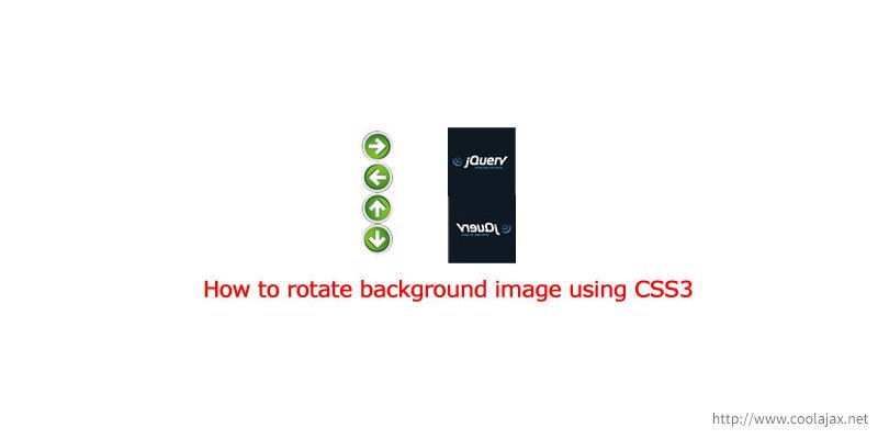
Today we are going to learn How to rotate a background image using css3. In this tutorial we also learn How to flip an image using css3.
We know CSS3 has awesome features to create our apps and website look & feel more attractive to our visitors. So, by using CSS3 we can easily enhance our web application. We can also save tons of JavaScript codes and instead of that we can just write less than 10 lines of CSS3 codes and output are still same. CSS3 also reduce loading time of website. So that, you can easily save your valuable bandwidth.
Rotate background image using CSS3 webkit-transform:
For mobile application it’s a very sensitive issue to reduce loading time. If your application sends individual request for each image then it may makes your apps/website slower. In that case we are just loading single image and by using CSS3 features we rotate that image. For rotating an image we’ve used webkit-transform property of CSS3. webkit-transform really a cool feature in CSS3. By using webkit-transform we can rotate any image in any direction from 0 Degree to 360 Degree.
– CSS Scripts:
body{font-family: verdana; font-size: 12px;}
h2{font-size: 13px;}
div.all-buttons{
    background: url('button.png');
    height: 48px;
    text-align: center;
    width: 48px;
}
div.right-rotation{
  background-position: 0 0px;
  background-repeat: no-repeat;
  -webkit-transform: rotate(180deg);
  -moz-transform:rotate(180deg);
}

div.left-rotation{
    background-position: 0 0px;
    background-repeat: no-repeat;
    -webkit-transform: rotate(0deg);
    -moz-transform:rotate(0deg);
}

div.top-rotation{
    background-position: 0 0px;
    background-repeat: no-repeat;
    -webkit-transform: rotate(0deg);
    -moz-transform:rotate(90deg);
}

div.bottom-rotation{
    background-position: 0 0px;
    background-repeat: no-repeat;
    -webkit-transform: rotate(0deg);
    -moz-transform:rotate(270deg);
}
– HTML Scripts:
<div class="all-buttons right-rotation"></div>
<div class="all-buttons lef-rotation"></div>
<div class="all-buttons top-rotation"></div>
<div class="all-buttons bottom-rotation"></div>
Flip an image using CSS3 webkit-transform
Flipping of an image is one of the most interesting and effective feature of CSS3. You can flip any image using this script. Just add an ID or class name with a image and refer it in your CSS code. Have a look-
– CSS Scripts:
body{font-family: verdana; font-size: 12px;}
h2{font-size: 13px;}
img.flip-image{
    -moz-transform: scaleX(-1);
    -o-transform: scaleX(-1);
    -webkit-transform: scaleX(-1);
    transform: scaleX(-1);
    filter: FlipH;
    -ms-filter: "FlipH";
}
– HTML Scripts:
<imgsrc="jquery_logo.png"class="flip-image">
Was this information useful? What other tips would you like to read about in the future? Share your comments, feedback and experiences with us by commenting below!

