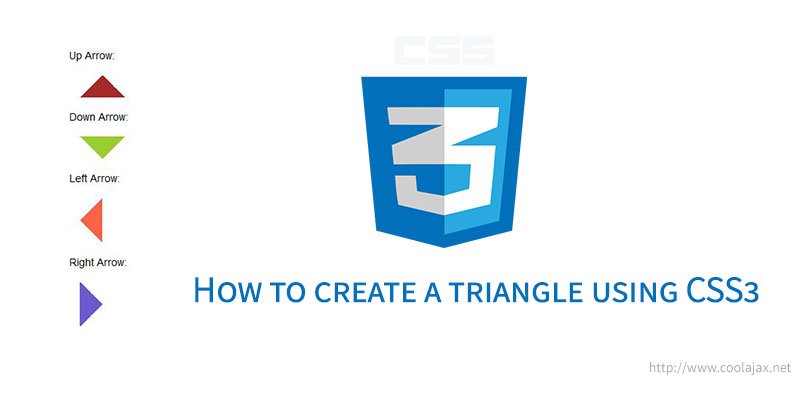
Today we are going to learn about how to create a triangle using CSS3. First of all it’s very simple to do, but required a to know a tip. We will use border-radius property to create that triangle. I’ve also added download and demo link just below the post. So you can check and download source code for future use. Let’s get started-
Idea of creating triangle using CSS3 is very simple but bit tricky. We need to create a div and assign a common class called “bwl-arrow”. We will make this div width and height zero(0px) and add 1em margin (optional). Then we will add few classes that will define the direction of arrow like – up, down, left and right. We will use CSS border property to create triangle.
Now, Idea of direction classes is – If you define an arrow for up direction you need to make left and right border transparent and add colors,width for bottom border. Remember one thing all border width must be same and it will give us a symmetric shape of triangle. In following example we will use 10px as border width. But you can add any size of border as you want. Let’s jump in to the code –
– HTML Snippets:
<div class="bwl-arrow-container">
  <p>Up Arrow: </p>
  <div class="bwl-arrow up"></div>
  <p>Down Arrow: </p>
  <div class="bwl-arrow down"></div>
  <p>Left Arrow: </p>
  <div class="bwl-arrow left"></div>
  <p>Right Arrow: </p>
  <div class="bwl-arrow right"></div>
</div>
– CSS Snippets:
.bwl-arrow-container{
    margin: 30px auto;
    width: 400px;
}

.bwl-arrow{
    width: 0px;
    height: 0px;
    margin: 1em;
}

.up{
    border-left: 30px solid transparent;
    border-right: 30px solid transparent;
    border-bottom: 30px solid #A52A2A;
}

.down{
    border-left: 30px solid transparent;
    border-right: 30px solid transparent;
    border-top: 30px solid #9ACD32;
}

.left{
    border-top: 30px solid transparent;
    border-bottom: 30px solid transparent;
    border-right: 30px solid #FE6347;
}

.right{
    border-top: 30px solid transparent;
    border-bottom: 30px solid transparent;
    border-left: 30px solid #6A5ACD;
}
Check Demo
Was this information useful? What other tips would you like to read about in the future? Share your comments, feedback and experiences with us by commenting below!

